March 20th, 2011

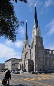
St. Paul's from the north
Walk south down Church St. from 24th and take in the commanding presence of St. Paul’s towers as you near 29th. Notice that distortion? Churches throughout history were built with one tower as originally designed, and the second later, in a completely new style — pardonable, given the several hundred years it took to finish the things.
But here, both towers are identical except for size. I haven’t asked anyone at the church yet, but my guess is that Frank Shea, the original architect, took the convention of disparate steeples and, while

The towers are identical, except for size.
matching them in every English Gothic detail, enlarged the north one to create the peculiarly Renaissance illusion of perspective distortion. (Btw, I’d swear this was the facade used in that Whoopi Goldberg film “Sister Act”.)
Posted in 94110 | No Comments » |
September 15th, 2010
 Every now and then I come across a book so enlightening, so thought-provoking, so intelligently written, it makes me want to toss out a score of others on my shelves lest I be tempted to waste time on them. I’ve listed the best below.
What I’ve included should not be construed as anything near comprehensive. It would be quite different had I simply haunted different bookstores. Have I left out a favorite? Let me know what I’ve been missing.
Note star ratings (1-5) are for degree of enlightenment/readability.
THEORY:
Paul-Alan Johnson, The Theory of Architecture, VNR. Awesomely comprehensive, every imaginable facet of architectural thought is reflected on, and with impressive depth. An omnibus, profound yet accessible; if I were allowed to keep only one book on architecture, this would be it. (*****/***)
Fil Hearn, Ideas That Shaped Buildings, MIT. A wonderfully easy to read primer on the history of theory. Unexpectedly enlightening for such simply-presented ideas. (****/*****)
Continue Reading »
Posted in Books, History | 3 Comments » |
March 5th, 2010
I’m always looking for “no-brainers” in construction — things to do that just make too much sense not to do. Here’s my experience with radiant barrier:
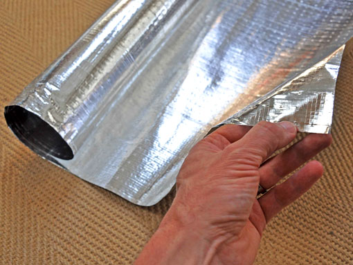
Radiant barrier is a heavy-duty aluminum foil that reflects 97% of the infra-red spectrum. It’s available on the underside of plywood roof sheathing for new construction, or in rolls for retrofits.

A fiber-reinforced radiant barrier, 48" wide roll.

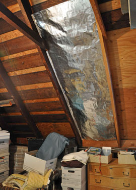
Barrier stapled in rafter bay about 3/4" below sheathing.
Rolls can be stapled between existing rafters, an inch or so down from the underside of the sheathing. No taping is needed (unless you’re trying to make an air or vapor barrier as well). Continue Reading »
Posted in Building Science, Tech Note | No Comments » |
December 12th, 2009
A surprisingly effective way to draw light into a room is by use of a light shelf. These horizontal reflectors are mounted either inside, outside, or on both sides of a southerly-facing window. Sunlight bounces off the surface and onto the ceiling within. Any bright surface will diffuse daylight effectively.
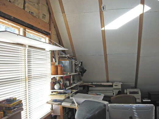
In my office though, I experimented with a pair of Ikea mirrors for more interesting light play. They’re mounted face up about 9″ down from top of glass, comfortably above eye level. The underside is painted white, to serve as a mini “ceiling” to the light reflected up from the venetian blinds below.

Mirrored light shelves reflecting sunlight onto ceiling
Continue Reading »
Posted in Tech Note | 5 Comments » |
June 20th, 2009
The San Francisco Museum of Modern Art is one of those designs contentious enough to split adherents and detractors right down the middle. Mario Botta, the museum’s architect, assembled his design from a palette of archetypal elements he arranges into a desired effect. The forms aren’t symbolic in that they mean anything, but they do convey general themes.
At the SFMoMA for example, the composition intimates sanctity, rootedness, exclusion from the outside, attention toward sun and sky, and so forth. This is done with a skylit cylinder set atop a nearly windowless, square masonry base, sheltering a broad opening of an entry. The masses hunch in a vaguely animorphic way, gazing over the recumbant postures of the Center for the Arts buildings across the street.
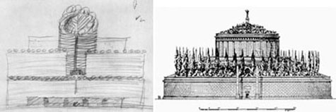
In his original proposal however, Botta’s ensemble was to be crowned with a ring of ficus trees planted atop the cylinder. This feature, almost unseen in the history of architecture, did figure prominently in the mausoleum of the ancient Roman emperor Augustus. Though only ruins of the mausoleum remain today, scholarly reconstructions all show an earthen mound over a windowless masonry cylinder and square base, planted with a great ring of oak or laurel trees.

Elevations: an early Botta sketch, and the reconstructed mausoleum.

Trees as seen on the SFMoMA and a reconstruction of the Mausoleum of Augustus.
Was the allusion to a mausoleum intentional? Was Botta making a subtle poke at the state of the art collection? And why is it that art should be so easily housed within such a tomb-like structure? Continue Reading »
Posted in Essay, History, Museums | 7 Comments » |
May 23rd, 2009
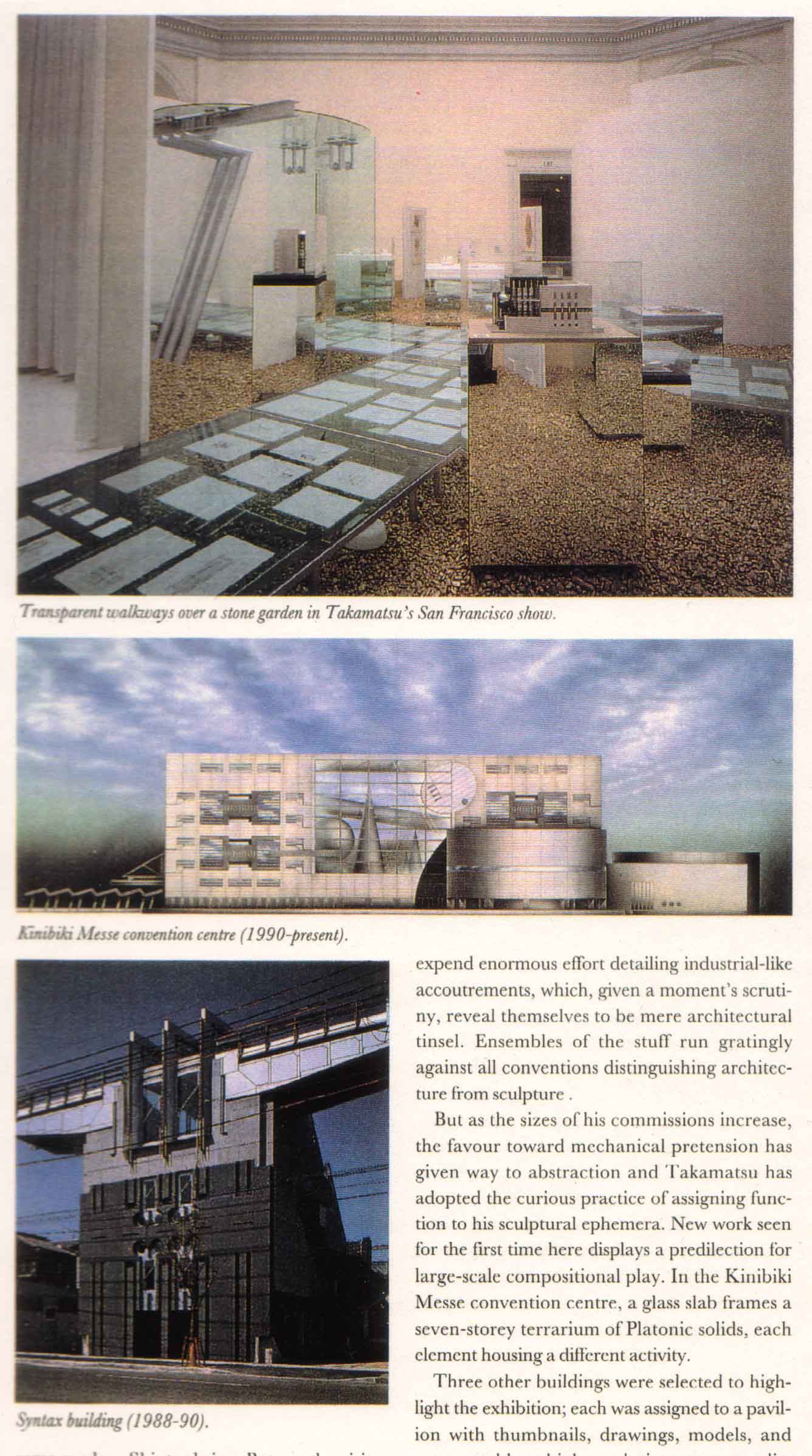
Here’s a piece I wrote for the June 1993 Architectural Review. Shin Takamatsu had just designed his own exhibition in the top floor rotunda of the old San Francisco Museum of Modern Art, at the War Memorial Building on Van Ness…
***

Photos from the article as published
To anyone already familiar with his work, the most surprising quality of Shin Takamatsu’s retrospective is its uncharacteristic grace.Mounted in the San Francisco Museum of Modern Art’s fourth floor atrium, and designed by Takamatsu himself, the space feels like the antithesis of the signature high-tech dazzle for which his buildings have come to be known.
Natural light filters down over white-draped pavilions, transparent walkways cross each other over a stone garden, the shoji-like skylight reflects in the glass underfoot.A tubular steel and glass torii arches one walkway as if to mark some modern Shinto shrine.But no, the visitor enters the space to a prattle of upbeat electronic soundtracks, dispelling any notion that he has perhaps found his way into the wrong exhibit.
The fantastic and highly personal style for which Takamatsu gained his notoriety abounds nevertheless in the work on display. Continue Reading »
Posted in Essay, Exhibits | No Comments » |


