Order Behind Disorderliness
November 14th, 2015“All discord [is] harmony not understood,” noted Alexander Pope. Discovering harmony in architecture, in what at first looks like discord, lends a wonderful richness and intrigue.
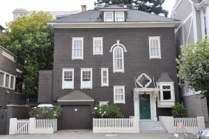
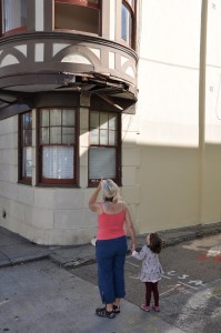
Take this house on Vallejo Street. Study the ostensible jumble of unaligned windows and they’ll slowly reveal the internal layout of rooms and stair behind the façade. A similar work without the underlying order would come off as unrewarding, or simply folly.
Conformity
November 7th, 2015Bertrand Russell on conformity, from “Furniture and the Ego”:
“Tolstoy describes somewhere a newly married couple who are giving their first evening party; when it is over, they congratulate each other on the fact that it has been exactly like anyone else’s evening party. Those to whom this is the highest ambition evidently fear contempt more than they hope for admiration, and in so far as they do hope for admiration they hope to secure it by successful imitation rather than by any genuine intrinsic quality. They may acquire taste, which can be learnt by those who take the necessary trouble, but they cannot acquire spontaneous enjoyment of the things that appear beautiful to them, whatever others may think of them.”
Catching Rays
November 1st, 2015The solar energy that today lands wasted on thousands of acres of deteriorating San Francisco roof membranes will in the future be treated as a hotly contested resource. Rooftops will have to be thoughtfully partitioned, with sunlight allocated in proper proportion to roof gardens, interior daylighting (skylights), photovoltaics, and solar hot water (though increasingly efficient PV panels are making it less expensive to heat water with electricity).
With this increase in attention, roofs will likely also become more common as extensions of living space, with a semi-isolation like that of the back yard—refuges in plain sight. Whatever the use, the increasing cost of urban real estate will not allow such a resource to remain vacant for long.
Carving through Nature
October 18th, 2015The Importance of Stuff
September 20th, 2015T. S. Eliot grew up surrounded by books. Frank Lloyd Wright’s mother covered his walls with architectural prints. Charles Ives was raised in a house full of musical instruments.
But what if Eliot had been raised among the architectural images? What if Ives had been raised with the books? Or for that matter, what if any of them had been raised in the minimalist interiors we see in today’s glossy magazines?
Surround yourself with stuff. It’s as important as a liberal education. Just give it order, and the uncluttered mind we’re all led to believe a minimalist interior would bestow on us will still come.
Bus Stop & Toilet Zealots
August 25th, 2015
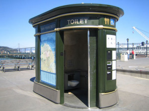
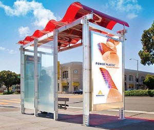
There’s a difficulty in designing one thing for multiple locations, such as a bus shelter or a public toilet. You can’t design for context since the surrounding of each installation is unique. Whatever the design, it can only display the unity of its own system.
Too often, this frees a designer to promulgate his particular style at the expense of all else.
Two such ubiquitous aliens pepper the sidewalks of San Francisco. The quaint-historical public toilets installed by JCDecaux look downright Disneyesque amid downtown’s modern office blocks. And the MUNI shelters of Lundberg Design’s Erector-Set aesthetic look especially graceless amongst the city’s myriad historical districts. Like a religious zealot and a hard-core atheist, each is too absorbed in its own convictions to acknowledge the other.
Oops — Low Clearance
April 15th, 2013Overproportion
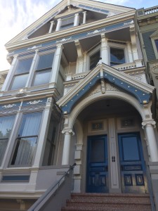
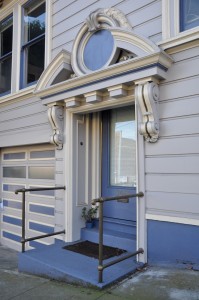
March 22nd, 2013The very normal-sized side door to this apartment house on Church is given proper entry status by an enormously over-proportioned broken pediment. Most delightful is how the thing weighs so heavily on the doorway it actually crops off the top of the door within.
The architect might have squeezed a normal pediment at the conventional height between the windows above, but the result would have felt uninspiringly narrow, too exposed, and lacking in the wry, ceremonial gravitas one feels crossing this threshold from civic to private space.
Another entryway, this one off Guerrero at 22nd swells a classic egg-and-dart pattern to the bulbous proportions of the vousoirs of an arch.
Over on Capp and 19th, heroically-scaled bays and portico actually cause a two and a half-story house to appear smaller than it is. Note how each window is considerably larger than the sizeable front door. Continue Reading »
Oops — No Wind
January 21st, 2013If we learn from our mistakes, students at Sanchez School will certainly benefit from the placement of this fence-top wind turbine. As anyone walking by could tell you, the generator would do better on top of this 40-foot edifice than at the sidewalk.
But would that be enough? Industry rule of thumb suggests placing turbines 30-feet over anything within a 500-foot radius. That gets you into the laminar winds above typical rooftop turbulence. It takes some expense though, and introduces structural and vibration-related building stresses, with related noise potentially amplified through the roof diaphragm.
And even at that elevation, a wind generator may not yield much. Say the turbine has a rated capacity of 1kW in 10-mph wind (though winds below 5-mph may not affect the rotors), the average wind is 10-mph, and we generously assume this site, downhill and leeward of Twin Peaks, yields a 10% capacity factor. Theoretically that would still be 100W, but real-world testing of micro wind generators is yielding results of only a fraction of manufacturer claims. Domestic-scale photovoltaic panels are producing more output, at less cost, and with a fraction of the maintenance wind generators require.
Wind power will certainly be in our future, but it’s going to be from large arrays, in open countryside, between migratory routes, and far from your rooftop.


