February 2nd, 2017

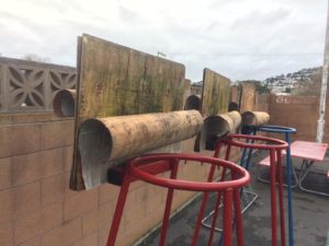
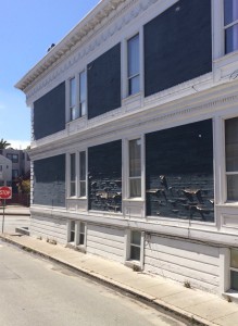
Plywood, meet Weather
A marine-grade plywood would have been a better choice for these backboards. Even an exterior-grade ply with its phenolic binders would have held onto the laminations, though edge protection is always a wise safeguard.
Posted in Building Science, Oops | No Comments » |
January 10th, 2017

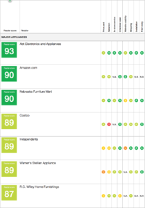
Major appliances online
Clients frequently ask which local appliance stores I recommend. Consumer Reports actually did a study of stores in June 2013, showing how much appliance shopping had moved online, even for large items. Highest rated will ship to the bay area: ABT Electronics and Appliances (score: 93), followed by Amazon (90), and Nebraska Furniture Mart (90). Best ranked local brick and mortars: Costco (89, though poor selection), Lowes (85), Best Buy (84), and Home Depot (84).
Ratings were based on price, selection, in-store service, checkout ease, website usability, shipping, installation, and haul-away. Rankings had remained quite consistent for the previous half dozen years.
Posted in Uncategorized | No Comments » |
January 10th, 2017
Important as color is, it sometimes blinds us to form. “I see in color, so I shoot in color,” Jay Maisel once told my uncle. But if what you want to convey is shape and volume, doing away with any distracting hues can be the best tool. Photo here is by Clyde Butcher.

No distractions
Posted in Aesthetics | No Comments » |
January 4th, 2017
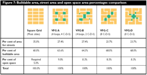
An interesting look at street grid patterns over the past century, and into the future: https://www.cmhc-schl.gc.ca/publications/en/rh-pr/tech/socio75.html

Street, buildable, and open area balance
Posted in History, Uncategorized | No Comments » |
November 19th, 2016

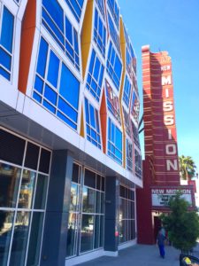
Fun House
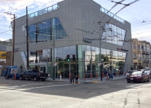
It is as perilous to design a prominent building in the giddiness of a tech-fueled economy as it is to go grocery shopping when you’re hungry. You may find yourself with buyers remorse the morning after. This could easily be the case with the New Mission Theater condos – a carnival’s fun house aesthetic on both the Mission Street and Bartlett Street sides.
Today this may come across as a welcome respite to Mission Street’s past several decades of dereliction. But architecture has the unenviable role of having to support its inhabitants through all their meandering moods—joy, yearning, optimism, uncertainty, celebration, grief. A dour neo-brutilist ediface can be as much of a downer when life is going great as the sight of a carnival is when you’ve just lost your job.
Posted in 94110, Aesthetics | No Comments » |
May 13th, 2016

Snøhetta and Botta together in place, if not spirit
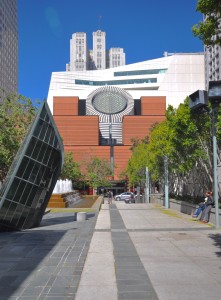
ArchNewsNow just published my article on the new SFMOMA. Specifically, I divulge how both Mario Botta’s original building and Snøhetta’s expansion each reflect the tenor or society at the time they were built.
ArchNewsNow, “The SFMoMA and Us“
Posted in Uncategorized | No Comments » |
March 13th, 2016

On this site, ethnicity was displaced.
Norwegian high-pitched roofs, Dutch gables, Russian Orthodox domes, Spanish colonial facades — scores of newcomers have visited upon San Francisco’s skyline the architecture of their homelands. These were built by immigrants, for immigrants, and evinced authentic culture.
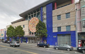
In contrast, it is downright disingenuous when an institution dons an ethnic pastiche of whatever culture happens to be in the neighborhood at the time. CCSF’s infill building on Valencia at 22nd, for example, is just such an ingratiating nod to the hispanic culture prominent in the Mission since the 1970’s.
In post-quake Chinatown in 1906, white architects were hired by Chinese Americans to contrive new buildings in an oriental style to draw visitors and support the economy. Pseudo-hispanic edifaces in the Mission however, harbor little of the latino population they were designed to celebrate, since rising rents have driven most from the neighborhood.
I imagine, given San Francisco’s tourist-oriented economy, that city hall may do what it can to keep Carnaval, Cinque de Mayo, and other Latino celebrations in the Mission. Sprinkling new public buildings with trappings from as rich a heritage as Latin Americans bring may be well-intended, but it will leave us with only the most superficial scraps of the culture when gentrification has displaced all those to whom it meant anything.
Posted in 94110, Aesthetics, History, Uncategorized | No Comments » |
January 16th, 2016

Influenced by the local color
Most architects just throw out something in hacienda style when they want to reflect the local culture here in the Mission…

Local color
Posted in 94110, Aesthetics, History | No Comments » |
December 6th, 2015

Quietude
I like deconstructivist architecture. I like it the same way, I think, that I’d like a night out on the town with Lady Gaga. But at the end of the evening, I’d rather return to a home like an Audrey Hepburn in that simple black dress.
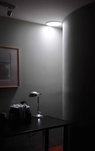
Home is, more than anything else, our place of refuge. Sure we entertain there. It may be an expression of ourselves. But after warming us and keeping the rain out, its primary purpose is refuge for contemplation and quietude.
Posted in Aesthetics, Theory | No Comments » |
November 22nd, 2015

Vapor always finds a way of escaping
Peeling paint in only some areas of this exterior suggests vapor was gradually making its way through from the inside, loosening the bond between the paint and the wall. Behind the peeling areas you’re likely to find a bathroom, kitchen, or other humid area without a good vent. If this were new, tightly-sealed construction, but still without a vent, it could have been worse: vapor migrating into a wall but unable to escape could have led to hidden mold. No wonder building codes are cracking down on proper bath and kitchen ventilation.
Posted in 94110, Building Science, Oops | No Comments » |
