Overproportion
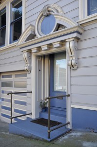
March 22nd, 2013The very normal-sized side door to this apartment house on Church is given proper entry status by an enormously over-proportioned broken pediment. Most delightful is how the thing weighs so heavily on the doorway it actually crops off the top of the door within.
The architect might have squeezed a normal pediment at the conventional height between the windows above, but the result would have felt uninspiringly narrow, too exposed, and lacking in the wry, ceremonial gravitas one feels crossing this threshold from civic to private space.
Another entryway, this one off Guerrero at 22nd swells a classic egg-and-dart pattern to the bulbous proportions of the vousoirs of an arch.
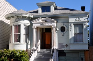
Over on Capp and 19th, heroically-scaled bays and portico actually cause a two and a half-story house to appear smaller than it is. Note how each window is considerably larger than the sizeable front door.
Over-proportioned features like this give a building at once more playfulness and more gravitas. But they are most successful in the context of neighbors that adhere to conventional proportions.
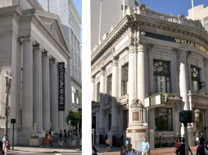
Look at the contrast downtown, where two buildings — both banks, both Beaux-Arts, both built in 1910 — sit opposite each other on Grant Street. Wells Fargo’s steroidal doric facade certainly looks like the safer place to stash your money than the elegant ionic facade (now an Armani store) across the street.


