Takematsu Tidbit from ’93
May 23rd, 2009
Here’s a piece I wrote for the June 1993 Architectural Review. Shin Takamatsu had just designed his own exhibition in the top floor rotunda of the old San Francisco Museum of Modern Art, at the War Memorial Building on Van Ness…
***

Photos from the article as published
To anyone already familiar with his work, the most surprising quality of Shin Takamatsu’s retrospective is its uncharacteristic grace.Mounted in the San Francisco Museum of Modern Art’s fourth floor atrium, and designed by Takamatsu himself, the space feels like the antithesis of the signature high-tech dazzle for which his buildings have come to be known.
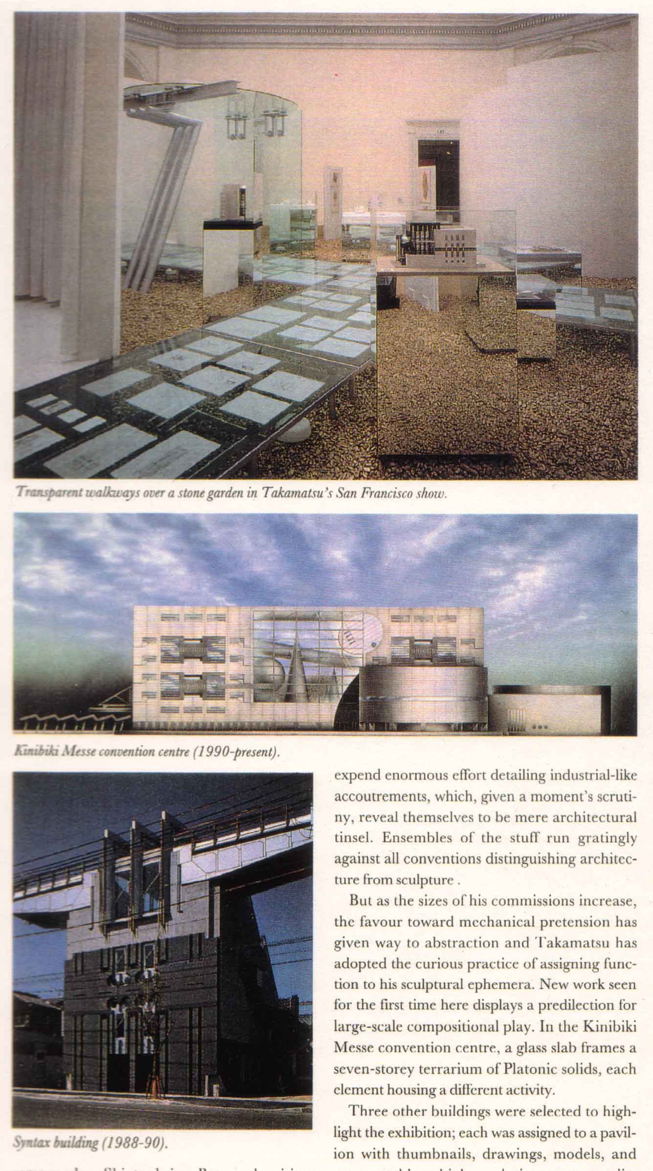
Natural light filters down over white-draped pavilions, transparent walkways cross each other over a stone garden, the shoji-like skylight reflects in the glass underfoot.A tubular steel and glass torii arches one walkway as if to mark some modern Shinto shrine.But no, the visitor enters the space to a prattle of upbeat electronic soundtracks, dispelling any notion that he has perhaps found his way into the wrong exhibit.
The fantastic and highly personal style for which Takamatsu gained his notoriety abounds nevertheless in the work on display.Here the proclivity isto expend enormous effort detailing industrial-like accouterments, which, given a moment’s scrutiny, reveal themselves to be mere architectural tinsel.Ensembles of the stuff run gratingly against all conventions distinguishing architecture from sculpture .
But as the size of his commissions increase, the favor toward mechanical pretension has given way to abstraction and Takamatsu has adopted the curious practice of assigning function to his sculptural ephemera.New work seen for the first time here displays a predilection for large scale compositional play.In the Kunibiki Messe convention center, a glass slab frames a seven-story terrarium of platonic solids, each element housing a different activity.
Three other buildings were selected to highlight the exhibition; each was assigned to a pavilion with thumbnails, drawings, models, and most notably, a high-resolution computer display, continuously running a 3-D representation of the building.The introduction of such graphics affords a comprehensiveness the traditional renderings fail to achieve.
Few of the works, unfortunately, provide much spatial play for the new medium to exploit.The computer animated display of such a static volume as the Kirin Plaza Osaka, for example, tells us nothing we can’t glean from the models.The building first appears on the monitor as a reflection in the canal it fronts.Panning back, we see the building in what could be an expansive asphalt desert, not the neon-packed district of Osaka where it actually stands.(Perhaps paving the city like this was deemed more appropriate, given Kirin’s symmetry all but ignores its site.)We are taken from the canal around the exterior of the building: up the walls, across the facade, in daylight and at night, from this angle and that, but never from the inside, and always to the pop beat of electronic background music.The whole sequence smacks of a promotional — nothing is flaunted but the building’s chrome-fitted facade.There is irony in viewing this architecture through technology the building can only feign.
Of greater novelty is a twelve-minute, high-definition 3-D projection video.Museum visitors don stereo headphones and image-polarizing 3-D glasses for dramatic footage of existing Takamatsu behemoths.Cameras pan through and around the structures in Orson Welles-like sweeps; boom-operated camera work takes the audience on crane rides far from anywhere a visitor to the actual buildings might find himself.And, once again, each building muscles about the screen to its own theme song.
If the video footage is gratuitous, the implications of the computer sequences are significant.Space has always been the stumbling block of architectural representation.Perspective, the isometric, and even models have their inherent limitations.But the dynamic quality of computer animation has the potential to renew attention to spatial design, both in conception as well as representation.One hopes to see the medium employed in future exhibits, preferably for a less static body of work .


